When you build Web applications in Visual Studio, it's almost as if you're developing a desktop application. With Visual Studio, you don't have to spend all your time typing ASP code. The designer is a great environment for designing a Web-based UI visually.
Building a Page with Visual Studio
To see how this works, let's develop a simple page that uses server-side controls. The page will look roughly like the ones we've seen so far.
-
Create a Web site to experiment with controls.
Use Visual Studio to create a new Web site. Call the Web site ControlORama.
-
Use the Designer.
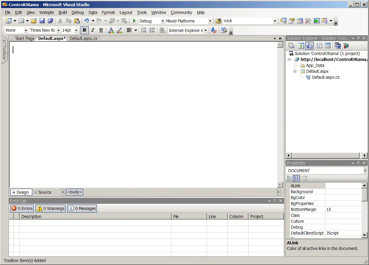
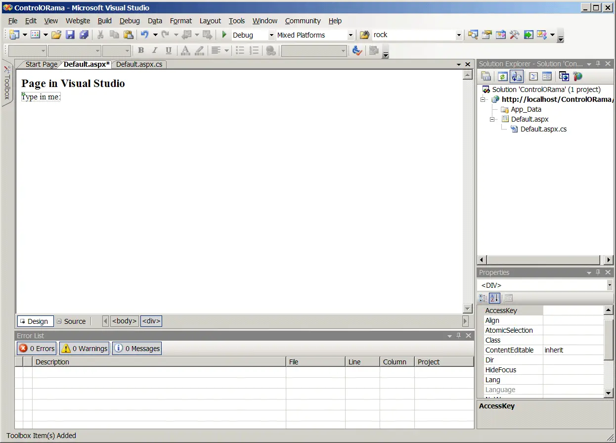
Visual Studio starts you off in default ASPX. In Designer mode, switch to the Design view as shown here.
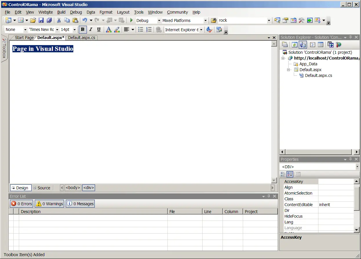
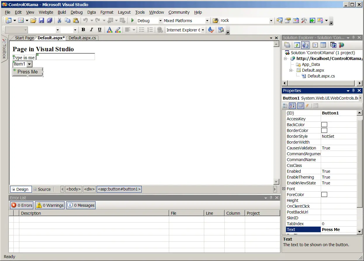
The ASP.NET code generated by Visual Studio includes an HTML <div> tag in the body of the page. If you simply start typing some text into the Design view, you'll see some text at the top of the page. The following figure illustrates the Design view.
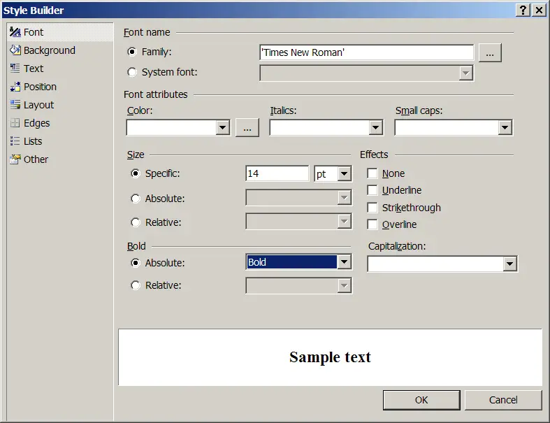
To edit the format of the text on the page, you need to view the page's properties. Highlight the text, right-click the text, and select Properties from the local menu. Then highlight the Style property in the Property dialog box. You'll see a small button appear in the Property field with an ellipsis (…). Click the button to reveal the Style Builder dialog box. The Style Builder sets the attributes for the <div> tag where you can set the font face and style. The following figure shows the Style Builder dialog box.
-
Open the Control toolbox.
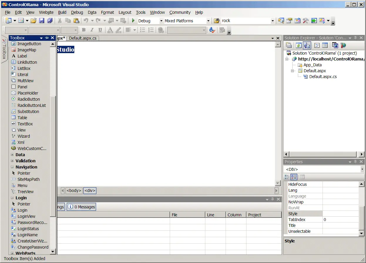
Next add a label to the page. Move the cursor to the Toolbox tab on the far left-hand side of Visual Studio. This will highlight the toolbox on the left as shown in the following graphic:
-
Add a label to the page.
Grab a label and drop it onto the page as shown in the following graphic:
-
Edit the content of the label.
To edit the content of the label, you need to view the control's properties. If the properties aren't showing, right-click on the label and select Properties from the shortcut menu.The following graphic illustrates the property window.
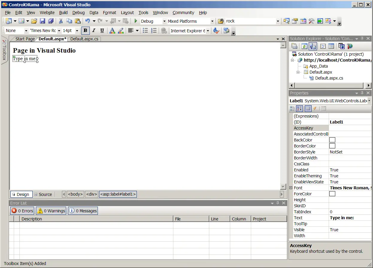
You can now manipulate the appearance of the label to your liking. The example label here uses a small Times New Roman font and the text in the label is Type in me:.
-
Add a text box.
Next, pick up a text box from the toolbox and drop it next to the label.
-
Add a drop-down list.
Next, add a DropDownList box by picking it up off the toolbox and dropping it onto the page. The following graphic illustrates the drop-down list as it appears in the designer. Notice the local menu for editing the data source and for adding items.
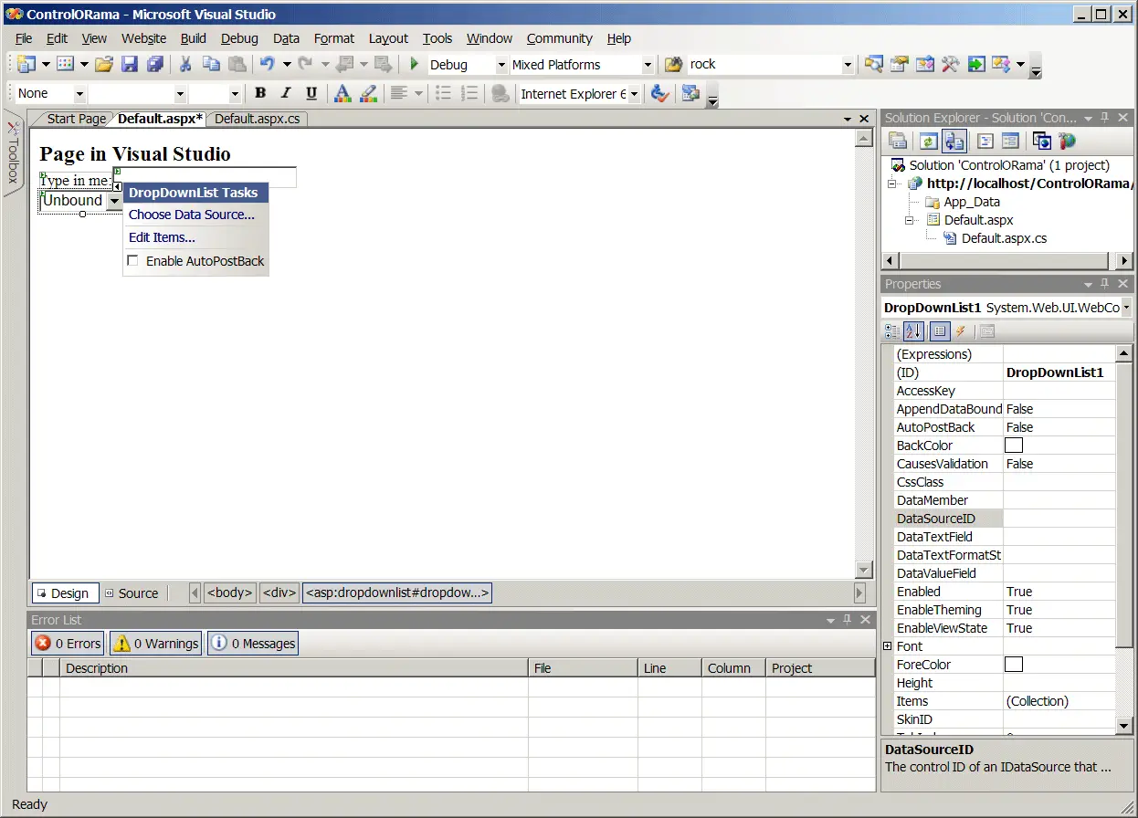
As soon as you drop the control onto the page, Visual Studio prompts you with the opportunity to add items to the DropDownList. Select Edit Items from the local menu. You'll see the ListItem Collection Editor dialog box as shown in the following graphic:
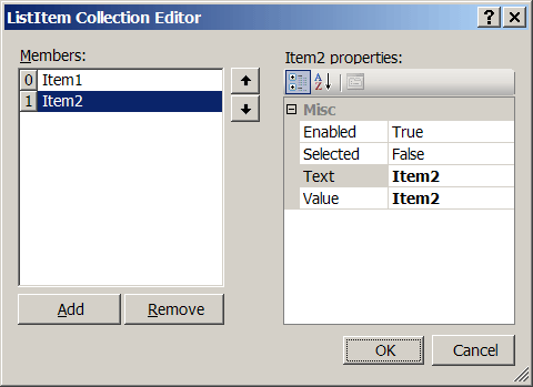
Each time you click the Add button, the ListItem Collection Editor adds a new item to the DropDownList item collection. You can edit the display name (the Text property). You may add a corresponding value to associate with the text as well. For example, in an inventory-tracking application, you might include a product name as the Text property and an enterprise-specific product code in the value field. You can retrieve either or both aspects of the item at runtime.
Add several of these items to the DropDownList.
-
Add a button to the page.
Do this by picking one up from the toolbox and dropping it on the page.The following graphic shows the controls in place.
Add some meaningful text to the button by modifying its Text property.
Before moving on, take a minute to look at the source code generated by Visual Studio. In adding a Label control, a TextBox control, a DropDownList control, and a Button control, Visual Studio has added four new member variables to your code. The contents of the ASPX file (within the form tag) looks something like Listing 3-5 now.
Listing 3-5
   <form id="form1" runat="server">
    <div>
        Page in Visual Studio<br />
        <asp:Label ID="Label1" runat="server"
          Text="Type in me:"
          Font-Bold="False" Font-Names="Times New Roman" Font-
          Size="Small">
        </asp:Label><asp:TextBox
         ID="TextBox1" runat="server"></asp:TextBox>
        <br />
        <asp:DropDownList ID="DropDownList1" runat="server">
            <asp:ListItem>Item 1</asp:ListItem>
            <asp:ListItem>Item 2</asp:ListItem>
            <asp:ListItem>Item 3</asp:ListItem>
            <asp:ListItem>Item 4</asp:ListItem>
        </asp:DropDownList><br />
        <asp:Button ID="Button1"
         runat="server" OnClick="Button1_Click"
         Text="Press Me" />
     </div>
    </form>
Notice each ASP.NET tag that runs at the server is given an ID attribute. This is the identifier by which the control will be known at runtime. We'll make user of that shortly.
-
Add an event handler for the button.
Finally, to make the button do something, you need to add an event handler to the page so it will respond when the button is clicked. The easiest way to do that is to double-click on the button in Design mode. Visual Studio will generate a handler function for the button press, and then show that code in the Source code view. At this point, you can add some code to respond to the button press. The following graphic illustrates the button handling event as it appears in the code editor.
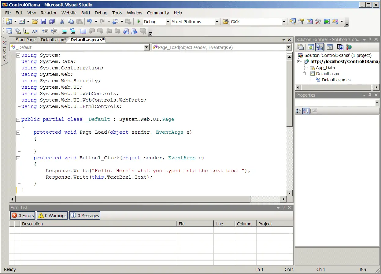
The code shown above responds to the button press by sending some text to the output stream via the Response object. The text coming through Response.Write will be the first text the client browser will see, and so will appear at the top of the page.
Notice that the response code uses the TextBox1 member variable in the page's class, showing that the controls are available programmatically at runtime. Here's how the page appears to the client browser:
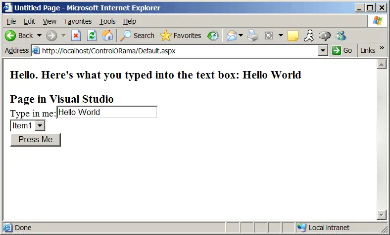
To test the controls on the page, browse to the page by selecting Debug | Start Without Debugging from the main menu.
Layout Considerations
You may have noticed when building the last page that the layout of the page flowed. That is, every time you dropped a control onto the page, the designer forced it up against the placement of the previous control. If you've worked with earlier versions of Visual Studio, you'll notice this is different default behavior. Visual Studio 2003 started off with absolute positioning for elements on a page (which is what you're used to if you've done rich client or standard Windows development).
To change the layout options for a Web page in Visual Studio 2005, select Layout | Position | Auto position Options… to get the layout options for the page. The following graphic shows the positioning options dialog box.
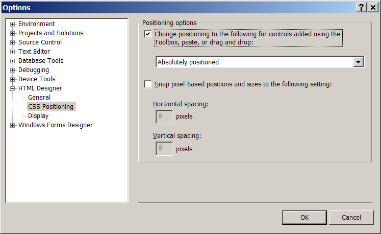
Turning on absolute positioning causes Visual Studio to place the controls exactly where you want them instead of your being confined to a flow layout. With absolute positioning turned on, Visual Studio adds positioning attributes to the controls as it places them on the Web form.