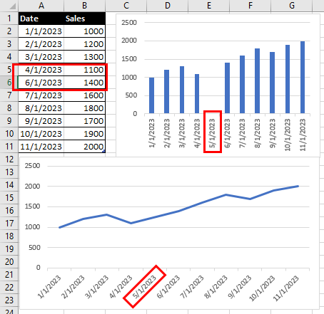
As the previous figure demonstrates, using time or date values for the horizontal axis makes a lot of sense for charting progress. Excel will put each date or time evenly on the axis, so you can easily track how things change over time. Follow these steps if your chart recognizes the dates (or times):
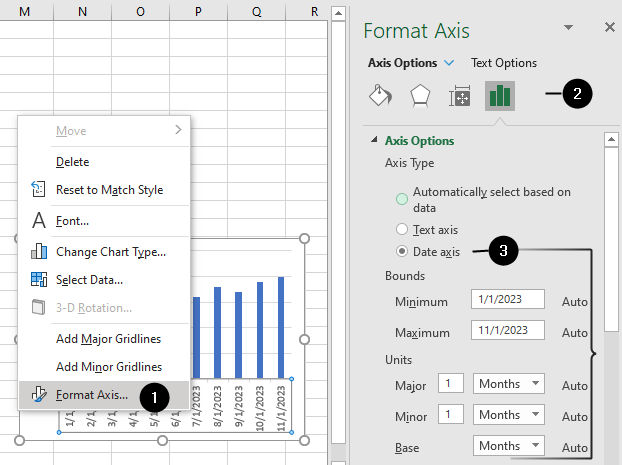
- Right-click on the X-axis (horizontal axis) in the chart. Select
Format Axis. - In the Format Axis pane on the right, choose
Axis Options. - Under
Axis Type, selectDate axis. When you select “Date axis,” Excel recognizes the values on the axis as dates and treats them accordingly. - To configure the Date axis options, visit How to change the scale on a chart.
By choosing the appropriate base unit, major unit, and minor unit, you can control the granularity of the date axis, making it easier for viewers to interpret the chart and understand the progression of time in your data.