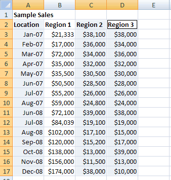
Suppose you have a table that shows the monthly sales of 10 different regional offices. However, you only want to compare the sales of two of these offices in a chart. Your chart will use the data in column A (which has the month of the sales) and the data in column C and column D (which have the total sales for the two regions you want to compare).
1) Select Non-Contiguous Range To Create a Chart
The easiest way to create this chart is to start by selecting the non-contiguous range that contains your data. Here’s what you need to do:
Region 1. When you create the chart, Excel includes only two series in the chart: one for Region 2, and one for Region 3.- First, use the mouse to select the data in column
A. - Hold down the
Ctrlkey while you click with the mouse again, and drag to select the data in columnsCandD. Because you’re holding down theCtrlkey, columnAremains selected as in the figure above. - Now choose
Inserttab from ribbon, and pick the appropriate chart type from theChartsgroup.
Excel creates the chart as usual, but uses only the data you selected in steps 1 and 2, leaving out all other columns.
2) Change/Remove Data Range Included in the Chart
The previoius approach works most of the time. However, if you have trouble, or if the columns you want to select are spaced really far apart, then you can explicitly configure the range of cells for any chart. To do so, follow these steps:
- Create a chart normally, by selecting part of the data, and then, from the
Chartsgroup in theInserttab of the ribbon, choosing a chart type. - Right-click on the chart, and choose
Select Data.The “Select Data Source” dialog box appears. - Use the
Legend Entries (Series)section to remove any data series you don’t want and add any new data series you do want.- Uncheck a sereies and click
OKto remove the series from the chart. - Select a series and click
Removebutton to remove it. - To add a new series, click
Add, and then specify the appropriate cell references for the series name and the series values.
- Uncheck a sereies and click
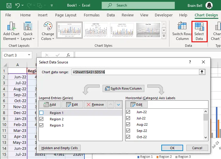
Chart data range box), it also lets you see how it breaks that data up into a category axis and one or more series (as shown in the Legend Entries (Series) list).You can also click Switch Row/Column to change the data Excel uses as the category axis and you can adjust some more advanced settings, like the way Excel deals with blank values and the order in which it plots series.