Displaying data in a well-conceived chart can make your numbers more understandable. Because a chart presents a picture, charts are particularly useful for summarizing a series of numbers and their interrelationships. Making a chart can often help you spot trends and patterns that may otherwise go unnoticed.
Excel provides a dizzying number of different chart types, but they all share a few things. In this section, you'll learn about basic Excel charting concepts that apply to almost all types of charts; you'll also create a few basic charts.
To create a chart, Excel needs to translate your numbers into a graphical representation. The process of drawing numbers on a graph is called plotting. Before you plot your information on a chart, you should make sure your data's laid out properly. Here are some tips:
- Structure your data in a simple grid of rows and columns.
- Don't include blank cells between rows or columns.
- Include titles, if you'd like them to appear in your chart. You can use category titles for each column of data (placed in the first row, atop each column) and an overall chart title (placed just above the category-title row).
If you follow these guidelines, you can expect to create the sort of chart shown in figure below:
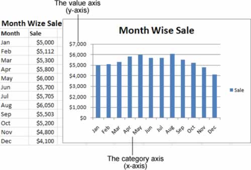
This figure shows a table of data and a simple column chart based on Excel's standard chart settings. Nothing fancy, but it gets the job done.