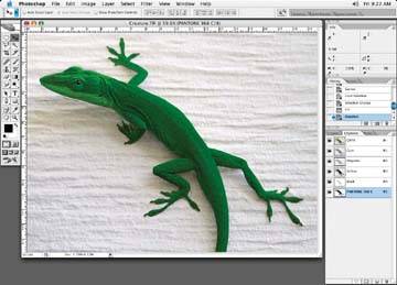
Figure - A touch plate added to this lizard will really make it stand out
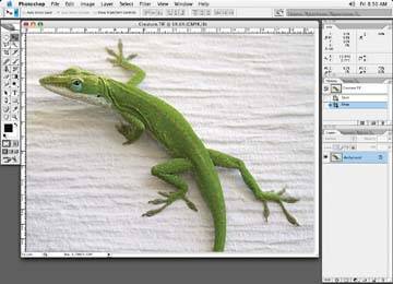
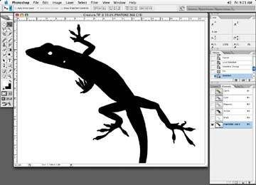
You first make a mask of the color areas you're going to enhance. Take care in making your mask, as any areas where the mask spills over onto another area will be very obvious when the final touch plate is complete. I'll usually mask the color areas with the Pen tool and add a small amount of softness to the selection generated from the Pen tool mask based on how the rest of the image looks, as in following figure.
Figure - Add a slight softness to the selection
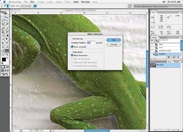
For instance, zoom into the image and have a look at lines or object edges within the image. This will give you an idea of how much softness to add to the mask. Once you've made a selection, go to Menu » Select » Feather and put in a pixel amount. The amount of softness usually falls into the .2 to 1 pixel range, but you will have to experiment. Once the mask is made, save the selection of the Pen tool path and make your selection.
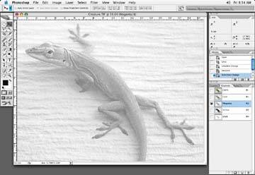
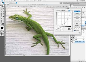
As we did in Tutorial 3, determine which color channel has the most shape and color. For instance, if the lizard is green, there will be a lot of information in the cyan and yellow channels. Look through the various channels either by clicking on each color channel in the Channels palette or by holding down the Command/Control key and clicking through the 1 (cyan), 2 (magenta), 3 (yellow), and 4 (black) numeric keys to skip through the various channels to find the best channel. As you can see in following figure, in this case, the magenta happens to have some of the best shape information. The cyan and yellow channels appear too full and lack detailed shape.
Figure - The magenta looks good for shape
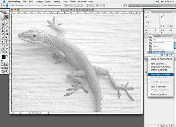
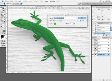
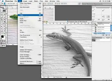
Once you choose a particular channel, in this case, the magenta, make a selection of the object from the mask you created earlier. While viewing the magenta channel only, make a copy of the color information of the lizard, using Command/Control+C or Edit » Copy. Then go to the Channels palette, and under the little arrow at the top right of the menu bar, select New Spot Channel, as in following figure.
Figure - Add a new spot channel
When the dialog box comes up, select the special color you (or the client) wish to use by clicking on the little colored square marked Color. You will then be presented with the Color Picker dialog box. Click on the Color Libraries button to the right of the box, and that will bring you to the Color Libraries dialog box, shown in following figure.
From this dialog box, in the Book drop-down menu, choose the type of Pantone color you would like to use, shown in following figure. Pantone has many PMS color books for various print media applications. For instance, if you wish to print a metallic color like a gold or silver, select the Metallic Coated option.
Figure - The Color Libraries dialog box
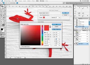
Figure - Select the correct book for your project
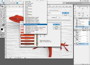
Typically, you'll use special color only in high-quality print work like magazines, and Pantone Metallic Coated is a typical choice, but do check with your clientor better yet, check with the printer that will be printing the job!
Once you have selected the right book, you can select the actual special color you would like to use. You can scroll through the list or quickly type in the PMS number from your keyboard (if you have an exact number), to find the PMS color in the list. In following figure, I've chosen a green.
Figure - Choose the correct Pantone number
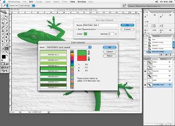
Always make sure the PMS number you select displays the correct name in the New Spot Channel dialog box it is important, as you'll see later.
Figure - Make sure the correct Pantone name appears in the dialog box
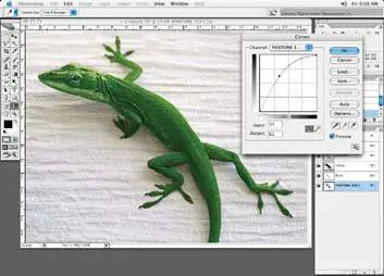
Before you click OK to accept the new spot channel, you will notice that there is also a solidity option in the New Spot Channel dialog box. The solidity option is purely a visual aidif you set it to 0 or 100%, it doesn't make a difference to the final output of the file. Visually, though, your Photoshop file will differ and, as you can see in following figure, it's not a very helpful way to view the file. Setting a value of 100% will make the PMS color look like a solid opaque tint, which is typical of a metallic special color, but it will be impossible to see what the final look of the image will be. Instead, try setting it to 0% to get an idea of the final look of the PMS color, as it adds the color to the existing four-color separation, as in following figure.
Figure - With the solidity set at 100%, it's hard to visualize the final outcome
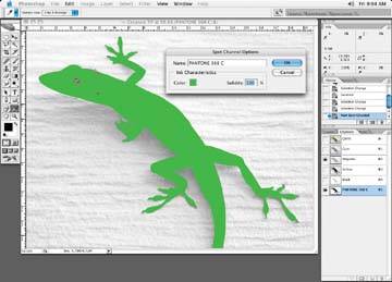
Figure 5-10. Setting the solidity to 0% gives a better sense of the image

Keep in mind that gold and silver special colors are opaque, which means they will cover up anything underneath them. For that reason, these special colors are often printed first, and then other colors are printed on top of them. This is true for most special colors, but metallic colors are particularly unforgiving. The solidity option, when set to 100%, will give you a good indication of what will happen with an opaque special color. Keep in mind, though, that it tends to hide the rest of the image and may not be a true representation of the final file because your printer will print the metallic special color first and the other colors on top of that. This is unclear when the solidity is set to 100%. This is assuming that the other colors or images in your file are not knocking out of the special color.
With the color selection still active, paste the magenta channel into the new special color channel.
Typically, a touch plate is a meant to be a subtle change in color, and the special color is applied at a percentage. In this case, let's knock back the newly created special color to 50%. Click on the special color channel and call up the curves color adjustment, as in following figure.
Figure 5-11. Paste the magenta channel into the new special channel that we copied earlier
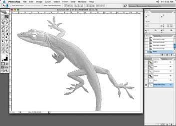
Figure 5-12. Adjust the color of the new special channel with a curve to suit the look you are after; here, we've made it a little darker
Next, take the 100% mark and drag it down to the 50% mark. You can also type 100 into the "input" box in the curve adjustment box and 50 into the "output" box. Follwing figure shows another option obtained by making a lighter curve adjustment.
Figure 5-13. You could also make a lighter curve adjustment
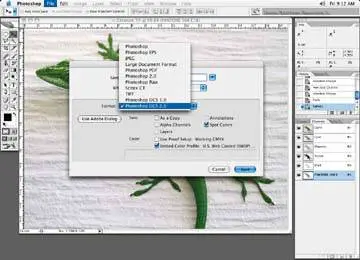
Whenever you create a file with a special color, remember to save the file as a DCS2 file (not a DCS1 file) as in following figure. DCS1 files are related to scanner files. I will add the extension .dcs2 to my filename so that anyone picking up the file will realize that there are special colors involved.
Figure 5-14. Save the special color file with DCS2 extension
Another way to create a touch plate is to duplicate the original image and turn it into a grayscale image. In this case, use Image » Mode » Grayscale to convert your image. Then copy the grayscale portion of the grayscale image that you need in this case, the lizard bodyand paste it into the special color channel of the original file, just as we did when we pasted the magenta channel earlier.
Figure 5-15. Make a copy of the grayscale image
For a touch plate, you will have to cut back on its density, which can be done to the grayscale image prior to pasting or on the special color channel, as described earlier. A simple way to do this with the grayscale image is to double-click on the Background layer so it becomes active, set its opacity to 50%, and then flatten the image before you copy it over. Creating a grayscale image makes for a quick and easy way to create a special color or touch plate.
Often touch plates or special colors end up looking flat, as in the following figure. This comes as a result of making a selection of the object color, for example, and simply filling the selection with a solid PMS tint that contains no shape. Don't fall into this trap. This is very amateurish. Make the extra effort to create the special color channel, as described above.
Figure 5-16. The special color in the Channels palette of a solid tint, and no shape at all
One thing to keep in mind is to make sure that the name of the spot color you use is correct. If the name is incorrect or not recognized, applications and printers may not print the file correctly, may substitute another color for your color, or may fail to print altogether.
Figure 5-17. The Channels palette applying a simple flat tint for the touch plate