You have actually used Skins already. Many server-side controls already support style templates. For example, when working with the TreeView earlier, you saw that you could apply one of several styles to it. Earlier in this tutorial we looked at applying a set of color attributes to the Menu control. In this section we'll see how Skins work and how to apply them.
Skin files define specific controls and the attributes that apply to them. That is, a .skin file contains server-side control declarations. The Skin file's job is to preset the style properties for the control. Skin files reside in named Theme folders for an application, accompanied by any necessary CSS files.
The following exercise illustrates how to create Skins for some controls on your Web site.
Create a Skin
-
Create a Skin file by right-clicking on the SeeingRed folder in the App_Theme node on the Solution Explorer and selecting Add New Item. Choose Text File from the templates. Name the file SeeingRed.skin.
-
In the "SeeingRed".skin file, pre-declare some controls for which you'd like to have default property values set. For example, the following SeeingRed.skin file declares default properties for some controls. These controls have their various colors defaulting to assorted shades of red.
<asp:Label runat="server" ForeColor="red"
Font-Size="14pt" Font-Names="Verdana" />
<asp:button runat="server" borderstyle="Solid"
borderwidth="2px" bordercolor="#ff0000" backcolor="#cc0000"/>
<asp:CheckBoxList runat=server ForeColor="#ff0000" />
<asp:RadioButtonList runat=server ForeColor="#ff9999" />
<asp:Table runat="server" Bordercolor="#ff9999" Borderwidth="2"
ForeColor="#ff3366"/>
-
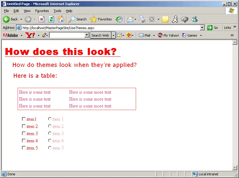
Now add those controls for which you've pre-declared attributes in the Skin file onto the UseThemes.aspx page to see how the SeeingRed.skin file applies. While you probably won't be able to see the effect in the following graphic, you will no doubt see the effect when running the sample application.
The SeeingRed.skin file will automatically be applied by declaring the SeeingRed Theme within the page. You may also prescribe different Skins at runtime, and you can apply separate Skins to each control.