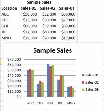
This chart has three series of sales figures (one for each year) and five sets of columns (one for each region). Each of the five sets has three bars, one for each data series. The regions are labeled on the category axis, but you'll need to consult the legend to determine which year each column represents.
But what causes the situation in the first place? Excel creates your charts according to the way the data's organized in your worksheet. A simple example shows you the effect.
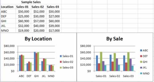
The worksheet in figure below looks at sales based on two factors: the year when the sales were recorded, and the region where the sales were made. In technical charting terms, the regions form the category axis, while the sales figures form the value axis. In other words, Excel creates a separate series for each year. But it makes just as much sense to organize the table in a different way, by making the year the category axis and creating a separate series for each region! Figure below contrasts these two different ways of looking at the same data, and shows how they affect the way Excel groups your data in a column chart.

This worksheet shows the same data charted in two different ways. In the right table, the category axis lists the sales years, which are used to group the regions. In the left table, the category axis lists the regions, which are used to group the years.
The column chart example is fairly simple. Although you may prefer one way of looking at the data over the other, they're relatively similar. However, most Excel charts aren't as forgiving. The line chart's a classic example.
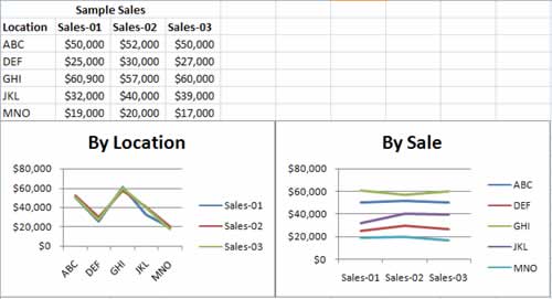
In a line chart, each line represents a different series. If you list the sales years on the category axis as shown in figure below, you end up with a separate line for each region that shows how the region has performed over time. But if you invert the table, you end up with a chart that doesn't make much sense at all: a series of lines that connect different regions in each year. Figure below illustrates the problem.
Clearly, when you create a line chart, you need to make sure the chart ends up using the data in a way that makes the most sense. So, how does Excel decide how to plot the data? Essentially, Excel makes a best guess about your data. If you have more rows than columns, Excel assumes that the first column represents the category axis. If you have more columns than rows (or if you have the same number of rows and columns), Excel assumes that the first row represents the category axis, as in figure below.

The chart on the right is pretty straightforward. The chart on the left shows a line for each year, which makes sense if you concentrate on what's being depicted, but mainly illustrates the way people can use computers to complicate things.
Fortunately, you have the power to override Excel's choice if you need to. Just select your chart, and then choose Chart Tools : Design > Data > Switch Row/Column. If you try this action on the charts in figure above, you reverse the results. Thus, the chart on the right would group the data into yearly series, and the chart on the left would group the data into regional series. To return them to normal, you can select each chart, and then click Switch Row/Column again.