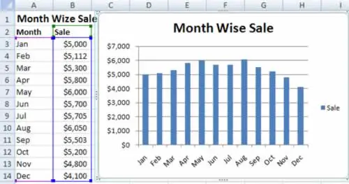
- Select the range of cells that includes the data you want to chart, including the column and row headings and any chart title. If you were using the data shown in above figure, you'd select cells A1 to B14.
For speedier chart building, just position your cursor somewhere inside the data you want to chart. Excel then automatically selects the range of cells that it thinks you want. Of course, it never hurts to remove the possibility for error by explicitly selecting what you want to use before you get started.
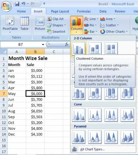
- Head to the ribbon's Insert Charts section. You'll see a separate button for each type of chart (including column charts, line charts, pie charts, and so on). Click the type you want. When you choose a chart type, you get a drop-down list of subtypes (see figure below).
The different chart types are explained in more detail later. For now, it's best to stick to some of the more easily understood choices, like Bar, Column, or Pie. Remember, the chart choices are just the starting point, as you'll still be able to configure a wide range of details that control things like the titles, colors, and overall organization of your chart.
- Click the subtype you want. Excel inserts a new embedded chart alongside your data, using the standard options (which you can fine-tune later).
