If you recall from earlier in the lesson, XHTML Mobile actually relies on WCSS for stylesheet support. Because WCSS is simply a subset of CSS, in this lesson I refer to styles generally as CSS styles. Just know that I'm technically talking about WCSS and not full-blown CSS.
The great thing about XHTML Mobile is that it is no different than using XHTML, except that it is more limited. So, if you know XHTML you already know XHTML Mobile. At worst, you'll just have to unlearn a few things because XHTML Mobile is a bit more limited than XHTML. Generally speaking, you'll find that XHTML Mobile can do just about anything markup-wise that you will want to do on a mobile web page.
As an example of how XHTML Mobile can be used in the context of a wireless application, I've reworked the King Kong movie description document as an XHTML Mobile document. Listing 23.9 contains the code for the moviedesc_kingkong.xhtml document.
Listing 23.9. The XHTML Mobile Version of the King Kong Movie Description Page (moviedesc_kingkong.xhtml)
 1: <?xml version="1.0"?>
 2: <?xml-stylesheet type="text/css" media="handheld" href="moviedesc.css"?>
 3: <!DOCTYPE html PUBLIC "-//WAPFORUM//DTD XHTML Mobile 1.0//EN"
 4:   "http://www.wapforum.org/DTD/xhtml-mobile10.dtd">
 5:
 6: <html>
 7:   <head>
 8:   </head>
 9:
10:   <body>
11:     <h1 align="center">***FILMTIME!***</h1>
12:     <p><i>King Kong</i> This remake of the 1933 classic follows an
13:       expedition to the mysterious Skull Island, where a legend of
14:       a giant gorilla draws explorers and filmmakers. The legend,
15:       however, is both real and dangerous, living in a massive
16:       jungle that has protected him and other prehistoric creatures
17:       for decades. Kong finds solace in a beautiful woman (Naomi
18:       Watts), and is subdued enough to be captured and brought back
19:       to New York. However, as the captors and the public will
20:       learn, it takes a lot more shackles to hold back an animal of
21:       such monstrous size.</p>
22:   </body>
23: </html>
There really aren't any surprises in the content part of this document as it consists of run-of-the-mill XHTML code with familiar H1, p, and i tags. The most interesting code that is unique to XHTML Mobile is the document type declaration and the stylesheet reference. The document type declaration references the XHTML Mobile 1.0 DTD (lines 3 and 4), which is publicly available at http://www.wapforum.org/DTD/xhtml-mobile10.dtd. The page imports the moviedesc.css stylesheet (line 2), which specifies colors and more exacting fonts for the King Kong movie content. Notice that there is an additional media attribute for the xml-stylesheet directive, and that it is set to handheld. This attribute allows you to establish the type of media that the page is targeting, which in this case consists of handheld devices.
Examples of other settings for the media attribute include all (the default), print, and tv. This attribute provides you with a mechanism for altering the specific formatting of content based upon how it is going to be viewed. In this case, you are formatting the content specifically for mobile handheld devices.
Listing 23.10 contains the code for the moviedesc.css stylesheet that is used to format the King Kong movie description XHTML Mobile document.
Listing 23.10. The WCSS Stylesheet for the XHTML Mobile King Kong Movie Description Page (moviedesc.css)
 1: body {
 2:   background: #FFFFFF;
 3: }
 4:
 5: h1 {
 6:   font-size: x-large;
 7:   color: #660000;
 8:   text-align: center;
 9:   text-decoration: underline;
10: }
11:
12: p {
13:   display: block;
14:   border: 1px #330000 solid;
15:   background: #660000;
16:   color: #FFFFFF;
17:   text-align: left;
18:   font-size: medium;
19:   padding: 4px;
20: }
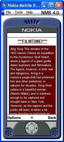
Figure 23.7 shows the results of viewing the King Kong XHTML Mobile page in the Nokia Mobile Browser Simulator.
Figure 23.7. XHTML Mobile allows you to create mobile web pages with more interesting styles applied to them than pure WML pages.

As the figure reveals, the stylesheet dramatically affects the look of the page as compared to the earlier version that was coded in WML (refer to Creating with Documents). Although you can't quite make out the colors in this printed figure, you can easily open the page for yourself in a WAP microbrowser and get the full effect.