If it is cost effective to use a special color, use the information you created for the black channel ice cream for use in a special PMS color. Then go back and delete any CMYK information so that the special color makes up only the ice cream information. Using special colors for packaging work is very typical. In fact, it is common to have many special colors in one image or package. There is another compelling reason to use special colors in a packaging image: registration.
Have you ever picked up a carton or package and noticed that the colors or picture elements don't butt up to one another? Or there is a white or clear line between elements because they were misaligned? This is because the printing press was unable to lay down each color channel exactly on top of one another in the exact same position it is supposed to be in.
A slight shift has occurred as the material ran through the press. Now imagine that you have to line up four colors or more! If you were to use special colors, you would have to worry about only one color. It's pretty tough to misalign one color!
Figure 9-19. Here is our ice cream image with a PMS color used for the ice cream instead of any process colors
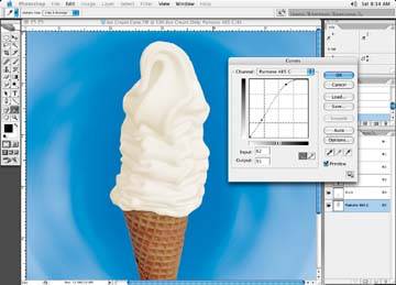
The selection of a special color is usually determined by looking through a Pantone color swatch book and deciding on the best color to use. Clients may ask to have a few different PMS colors run at the same time on a proof, and then decide on the best color to use. The colors have numbers associated with them and can be viewed in the Color Picker within Photoshop. You may want to test a few different Pantone special colors until the right color is determined. In Figure 9-19, our ice cream now has a color all its own.
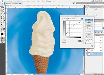
Let's add a little more contrast to our ice cream image, just to give it a bit more shape. Figure 9-20 shows the results of our efforts. Now try the gain curve on the image just to see how it might look after printing. We have a winner! The image has all the qualities we desire, and the specifications are met. I think it is ready to print.
Figure 9-20. Hungry for ice cream?
Quark can have an issue with the special color name as well. The operator may be using the same spot color in another area of the file, but with a different name. Quark will see your special color, assume it is a different color, and create another output channel just because of a different name. This is something to keep in mind.
Make sure the name of the Pant one color is correct when you create a new spot color in your channels. If you print your final file to a digital printer and the spot channel is not in the printer's profile, which is a setup function of the printer, the color may not print at all, or it will be substituted with another color that the printer may make up.