Neutralizing RGB Images
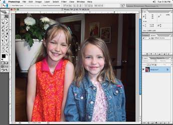
In RGB, it's pretty easy to obtain a neutral look in a full color image. Usually, if you balance the highlight and shadow areas, the rest of the image will fall into place. For instance, if you started with the image Figure 3-37, look for the whitest area in the image and make of the values in the image the same.
Figure 3-37. The original shot needs neutralization
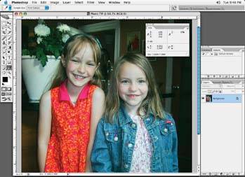
For example, make a white area R5, G5, B5. You can use the Curve adjustment tool or the Selective color correction tool to set the highlight and shadow area neutral points, as shown Figure 3-38. Use the Color Sampler tool and the Information palette to see what the values are as you make changes with the color correction tools to balance these two areas.
Figure 3-38. Adjust the highlight with the Curve adjustment tool to a perfectly even number in all channels
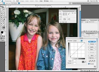
You don't want to blow out an area to the point that there are no values left there. You may get rid of any subtle shape if you do this. Just make sure you leave minimum dot in the very lightest areas.
Next, you want to go to the shadow area of your image and, using your curves, balance all the colors there as wellfor example, R250, G250, B250as in Figure 3-39. Again, just like the highlight area, the opposite holds true here: you do not want to plug up or fill in the shadow areas, for risk of losing subtle shadow detail. Avoid making the shadow areas R255, G255, B255.
Figure 3-40 shows the final image.
The exception to blowing out an area to no dot is the creation of a spectral highlight. A spectral highlight is the type of starburst sparkle you may see on a glass.
Figure 3-39. The shadow end of the image adjusted; again, look for a perfect balance in all channels
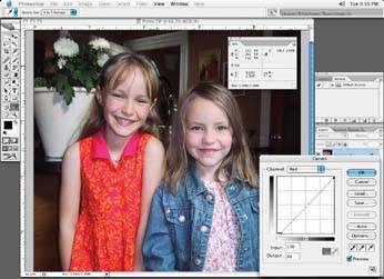
Figure 3-40. The final image
Neutralizing CMYK Images
CMYK neutrals are a little harder to obtain because the cyan values must always be higher than the magenta or yellow to be considered neutral. A good starting balance for neutrals is shown in Table 3-1.
Table 3-1. Starting balance for neutrals in CMYK using the same curve method as with the RGB images
|
Cyan |
Magenta |
Yellow |
Black |
|
|---|---|---|---|---|
|
Highlight |
4 |
2 |
2 |
0 |
|
Midtones |
58 |
50 |
50 |
Depends on image |
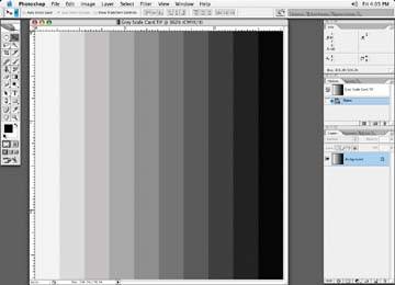
This assumes that there is a neutral area in the image to take a reading of, which may be something that exists only in an ideal world. If you have any say in how the image is shot in the first place, it is nice to have a grayscale card included with your image like the one shown in Figure 3-41. It would help you make accurate color corrections. If an image has a grayscale card included, it may be helpful because the card is neutral; adjusting your image until the card is neutral should cause everything else in your image to fall into place. Obviously, if the card appears way off in color, you know there is a problem. However, often there is no grayscale card included, and you'll just have to do the best you can to neutralize the image. Try correcting areas that you feel are off, like a skin tone or a blue sky, and hope that the rest of the image will fall into balance.
Figure 3-41. A grayscale card
I have left black out, because black is typically used for shape and could be adjusted visually to obtain the desired look. Avoid making the black solid, as, depending on the image, you could fill in shadow detail. Unless it is a flat tint, of course.
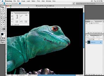
Occasionally you'll be asked to put an image onto a black background or solid tint. Of course, the tint may be made up of the four process colors, and the tint values will be spelled out for you. If the tint is to a solid black background, then it is typical to make the black tint 100% black with a support of a 40% cyan (this is very typical for newsprint). This helps to give the black a richer look, as in the "space" behind the lizard in Figure 3-42.
Figure 3-42. Black tinted background with a 40% cyan support
