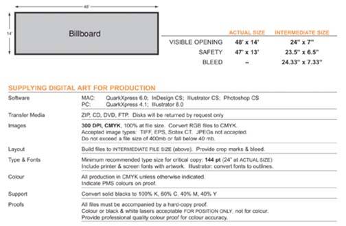
Typical example of a spec sheet from a billboard company

Take note of the physical size the final image should be, both in dimensions and megabyte size. Also note the resolution and color mode desired.
Let's break down some of the information on this billboard specification sheet so you have a clear understanding of it.
Note: It is important to follow any specifications given to you by a supplier, not only for the billboard discussed here, but any time your work will be outsourced, because you can be charged fees if your supplier has to go into the image and rework it in some way. Pretty tough to turn around and charge the client for these charges, especially when you
SoftwareThis is the software that the billboard company supports, and your files should be compatible with this software.
Transfer mediaThis is the media that the billboard company supports.
ImagesThis is the area you should be concerned with. Build your image so that one inch equals one foot. In the case of this billboard, the Photoshop file will be 48" wide and 14" high. To produce a file that is no more than 400 megabytes, that would mean a resolution of about 395 dpi. If you build a file to the maximum limits, you get the best file possible. JPEGs are not acceptable, and saving a file as an uncompressed TIF file will save you about 25% of the size over an EPS file, so you may want to save the file as a TIF.
LayoutAs I mentioned before, building the file so that one inch equals one foot keeps things simple!
Type and fontsFonts and text are usually placed in the ad with a program like Quark or InDesign, as this is the best way to assure that the type looks sharp and clean. The exception to this is if the text is to be placed in the Photoshop file because it is to be manipulated in Photoshop.
Color-
Files are to be supplied as CMYK files. You are best off supplying them as CMYK. That way, you know how you converted the files and what color profile you assigned to the file. The billboard company may accept an RGB file, but then you leave the conversion process to them. They may or may not convert the file the way you want it, and a color shift may occur depending on the color profile they select. Why leave it to chance?
Support-
Some people who are inexperienced may simply supply a file with a black area as black only, with no other color in it. When you use the other three colors in a black area, it makes it appear much richer and more solid. The optimum color breakdown is 100% black, 60% cyan, 40% magenta, and 40% yellow. This color combination gives you a nice neutral black as well. Those ink values add up to 240, which may or may not be the maximum amount of ink in a dark area regardless of the color. I'd put a call in here to make sure of my maximum ink density in a shadow or dark area.
Proofs-
The reason why the billboard company (or whoever you're processing the file for) will want a quality accurate proof is that they want some kind of a reference as to how you want the final output to look. It's no good to spit out a great looking proof from your uncalibrated inkjet printer, which has no relevance to what the color will really look like upon output on a printing press. Typical film houses are good sources for accurate proofs, as they have specialized proof outputs that simulate real world press outputs. (This is discussed in greater detail in Tutorial 1.) You and your clients are typically expected to sign off on these proofs as your acceptance to the look of the proof output. If the output from the press matches the proof you have signed off on, they have done their job. No complaining at that point!
Note: Don't be afraid to ask if you are not sure. If they do have to make some adjustments for you, you may be charged for it.
One additional spec you should keep in mind is the minimum required dot. To determine the minimum, take a highlight area of your image and consider what would be the smallest dot you can have in an area that will hold on press? You may have a 3% dot in a highlight area, but the press may only be able to hold and print a 5% dot.