Although relative positioning might sound somewhat limiting, you have to keep in mind that child elements are always positioned relative to their parents. So, the hierarchy of elements in an XML document can dramatically affect how the elements appear when styled with CSS. As an example, take a look back at the code for the contacts.css style sheet in Your First CSS Style Sheet in the previous section. You'll notice that the contact and name elements appear to be completely independent from a CSS perspective, but when used in XML code the name element is a child of the contact element. Therefore, when using relative positioning, the name element is displayed with respect to the contact element. In other words, the name element appears within the rectangular area set aside for the contact element, which in this case is 350 pixels wide.
Relative positioning is the default positioning approach used by CSS, so if you don't specify the positioning of a style rule, it will default to relative positioning.
The other type of positioning supported by CSS is known as absolute positioning because it allows you to set the exact position of XML content on a page. Although absolute positioning gives you the freedom to spell out exactly where an element is to appear, this position is still relative to any parent elements that appear on the page. Even so, absolute positioning allows you to specify the exact location of an element's rectangular area with respect to its parent's area, which is very different from relative positioning.
There is a potential problem associated with the freedom of placing elements anywhere you want on a page via absolute positioning. I'm referring to overlap, which is when an element takes up space used by another element. In this case, CSS relies on the z-index of each element to determine which element is on the top and which is on the bottom. You learn more about the z-index of elements in the next section. For now, let's take a look at exactly how you control whether or not a style rule uses relative or absolute positioning.
The type of positioning (relative or absolute) used by a particular style rule is determined by the position property, which is capable of having one of the following two values: relative or absolute. After specifying the type of positioning, you then specify the position of a style rule using the following properties:
-
leftThe left position offset -
rightThe right position offset -
topThe top position offset -
bottomThe bottom position offset
These position properties are interpreted differently depending on the type of positioning used. Under relative positioning, the position of an element is specified as an offset relative to the original position of the element. So, if you set the left property of an element to 25px, the left side of the element will be shifted over 25 pixels from its original (relative) position. Because the original position of the element is relative to other elements, the final position is still considered a relative position. An absolute position, on the other hand, is specified relative to the parent of the element to which the style is applied. So, if you set the left property of an element to 25px under absolute positioning, the left side of the element will appear 25 pixels to the right of the parent element's left edge.
To better understand the difference between absolute and relative positioning, check out the following XML code:
<squares>
  <square>
  Square One
  </square>
  <square>
  Square Two
  </square>
  <square>
  Square Three
  </square>
  <square>
  Square Four
  </square>
</squares>
Admittedly, this XML code doesn't mean much, but it's a good way to demonstrate the difference between relative and absolute positioning. Notice in the code that there are several square elements, each with a different class and therefore a different style rule. Listing 10.3 contains a style sheet for this code that uses relative positioning to arrange the squares.
Listing 10.3. The squares_rel.css Style Sheet That Uses Relative Positioning to Style the Squares XML Document
 1: square {
 2:   display:block;
 3:   position:relative;
 4:   width:100px;
 5:   height:75px;
 6:   border:10px single black;
 7:   color:black;
 8:   text-align:center;
 9: }
10:
11: square.one {
12:   background-color:red;
13: }
14:
15: square.two {
16:   background-color:green;
17: }
18:
19: square.three {
20:   background-color:blue;
21: }
22:
23: square.four {
24:   background-color:yellow;
25: }
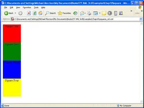
This code sets the position style property to relative (line 3), which explicitly causes the square style rule to use relative positioning. Because the remaining style rules are inherited from the square style rule, they also inherit its relative positioning. In fact, the only difference between the other style rules is that they have different background colors. Figure 10.2 shows the Squares document as it is displayed in Internet Explorer using the style sheet with relative positioning.
Figure 10.2. The Squares example document is displayed in Internet Explorer using a style sheet with relative positioning.

Notice in the figure that the square elements are displayed one after the next, which is what you would expect from relative positioning. To make things more interesting, you can change the positioning to absolute and explicitly specify the placement of the squares. Listing 10.4 contains a modified style sheet for the Squares document that uses absolute positioning to arrange the squares.
Listing 10.4. The squares_abs.css Style Sheet That Uses Absolute Positioning to Style the Squares XML Document
 1: square {
 2:   display:block;
 3:   position:absolute;
 4:   width:100px;
 5:   height:75px;
 6:   border:10px single black;
 7:   color:black;
 8:   text-align:center;
 9: }
10:
11: square.one {
12:   background-color:red;
13:   left:0px;
14:   top:0px;
15: }
16:
17: square.two {
18:   background-color:green;
19:   left:75px;
20:   top:25px;
21: }
22:
23: square.three {
24:   background-color:blue;
25:   left:150px;
26:   top:50px;
27: }
28:
29: square.four {
30:   background-color:yellow;
31:   left:225px;
32:   top:75px;
33: }
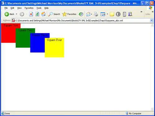
This style sheet sets the position property to absolute, which is necessary in order for the style sheet to use absolute positioning (line 3). Additionally, the left and top properties are set for each of the inherited square style rules. However, the position of each of these rules is set so that the elements will be displayed overlapping each other, as shown in Figure 10.3.
Figure 10.3. The Squares example document is displayed in Internet Explorer using a style sheet with absolute positioning.

This figure shows how absolute positioning allows you to place elements exactly where you want them. It also reveals how easy it is to arrange elements so that they overlap each other. You might be curious as to how a web browser knows which elements to draw on top when they overlap. Fortunately, CSS includes a style property that gives you complete control over the appearance of overlapped elements.
Tinkering with the z-Index
You just saw how it doesn't take much trouble to position elements on a page so that they overlap each other. There are no doubt situations where you'd like to be able to carefully control the manner in which elements overlap each other. For this reason, CSS includes the z-index property, which allows you to set the order of elements with respect to how they stack on top of each other. Although the name z-index might sound a little strange, it refers to the notion of a third dimension (Z) that projects into the computer screen, in addition to the two dimensions (X and Y) that go across and down the screen. Another way to think of the z-index is the relative position of a magazine within a stack of magazines. A magazine nearer the top of the stack has a higher z-index than a magazine lower in the stack. Similarly, an overlapped element with a higher z-index is displayed on top of an element with a lower z-index.
The z-index of a style rule is specified using the z-index property, which is set to a numeric value that indicates the relative z-index of the rule. The number assigned to a z-index has meaning only with respect to other style rules in a style sheet, which means that setting the z-index for a single rule doesn't really mean much. On the other hand, if you set the z-index for several style rules that apply to overlapped elements, the elements with the higher z-index values will appear on top of elements with lower z-index values.
Regardless of the z-index value you set for a style rule, an element displayed with the rule will always appear on top of its parent.
Listing 10.5 contains another version of a style sheet for the Squares XML document that has z-index settings to alter the natural overlap of elements.
Listing 10.5. The squares_z.css Style Sheet Alters the z-order of Elements in the Squares XML Document
 1: square {
 2:   display:block;
 3:   position:absolute;
 4:   width:100px;
 5:   height:75px;
 6:   border:10px single black;
 7:   color:black;
 8:   text-align:center;
 9: }
10:
11: square.one {
12:   background-color:red;
13:   z-index:0;
14:   left:0px;
15:   top:0px;
16: }
17:
18: square.two {
19:   background-color:green;
20:   z-index:3;
21:   left:75px;
22:   top:25px;
23: }
24:
25: square.three {
26:   background-color:blue;
27:   z-index:2;
28:   left:150px;
29:   top:50px;
30: }
31:
32: square.four {
33:   background-color:yellow;
34:   z-index:1;
35:   left:225px;
36:   top:75px;
37: }
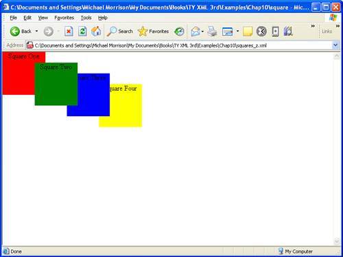
The only change in this code from what you saw in Listing 10.4 is the addition of the z-index settings in each of the derived square style rules. Notice that the first square has a setting of 0 (line 13), which should make it the lowest element in terms of the z-index, whereas the second square has the highest z-index (line 20). Figure 10.4 shows the Squares document as displayed with this style sheet, which clearly shows how the z-index impacts the displayed content.
Figure 10.4. The Squares example document is displayed in Internet Explorer using a style sheet that alters the z-order of the squares.

The figure reveals how the z-index style property makes it possible to carefully control the overlap of elements.
Creating Margins
CSS supports margins that allow you to add empty space around the outside of the rectangular area for an element. Following are the style properties that you use to set the margins for style rules:
-
margin-topSets the top margin -
margin-rightSets the right margin -
margin-bottomSets the bottom margin -
margin-leftSets the left margin -
marginSets the top, right, bottom, and left margins as a single property
You can specify margins using any of the individual margin properties or with the single margin property. Regardless of how you set the margins for a style rule, it's important to note that you can specify the size of a margin using either units or a percentage. If you decide to set a margin as a percentage, keep in mind that the percentage is calculated based upon the size of the entire page, not the size of the element. So, if you set the margin-left property to 25%, the left margin of the element will end up being 25% of the width of the entire page. The following code shows how to set the top and bottom margins for one of the squares in the Squares XML document that you've been working with throughout this tutorial:
square.two {
  background-color:green;
  margin-top:5px;
  margin-bottom:20px;
}
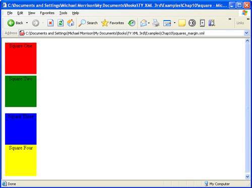
In this example, the top margin is set to 5 pixels, and the bottom margin is set to 20 pixels. The results of this code are shown in Figure 10.5.
Figure 10.5. The Squares example document is displayed in Internet Explorer using a style sheet that sets top and bottom margins for one of the squares.

This figure shows how the top and bottom margins appear above and below the second square. Keep in mind that these margins don't encroach on the content area of any of the squaresthey all maintain their original size. In other words, the margins appear around the elements.
If you want to set all the margins for a style rule, you'll probably want to simplify the code and use the margin property. This property is somewhat flexible in that it offers three different approaches to specifying the margins for a style rule. These different approaches vary based upon how many values you use when setting the margin property:
-
One value The size of all the margins
-
Two values The size of the top/bottom margins and the left/right margins (in that order)
-
Four values The size of the top, right, bottom, and left margins (in that order)
As you can see, the margin property allows you to provide one, two, or four values when you set it. Following is an example of how you would set the vertical margins (top/bottom) to 5 pixels and the horizontal margins (left/right) to 10% for a style rule:
margin:5px 10%;
In this code, the top and bottom margins are both set to 5 pixels, whereas the left and right margins are both set to 10%. Of course, if you wanted to be a little clearer you could achieve the same effect with the following setting:
margin:5px 10% 5px 10%;
A Little Padding for Safety
Similar to margins, padding is used to add extra space to elements via CSS style properties. However, padding differs from margins in that padding adds space inside the rectangular area of an element, as opposed to around it. For this reason, padding actually imposes on the amount of content area available within an element. As an example, if you create a style rule for an element that establishes a width of 50 pixels and a height of 30 pixels and then sets the padding of the rule to 5 pixels, the remaining content area will be 40 pixels by 20 pixels. Also, because the padding of an element appears within the element's content area, it will assume the same style as the content of the element, such as the background color.
You specify the padding of a style rule using one of the padding properties, which work very much like the margin properties. The following padding properties are available for use in setting the padding of style rules:
-
padding-topSets the top padding -
padding-rightSets the right padding -
padding-bottomSets the bottom padding -
padding-leftSets the left padding -
paddingSets the top, right, bottom, and left padding as a single property
Similar to margins, you can set the padding of style rules using individual padding properties or the single padding property. Padding can also be expressed using either a unit of measurement or a percentage. Following is an example of how you might set the left and right padding for a style rule so that there are 10 pixels of padding on each side of an element's content:
padding-left:10px;
padding0-right:10px;
Also similar to margins, you can set all of the padding for a style rule with a single property, the padding property. You can use the same three approaches available for the margin property to set the padding property. Following is an example of how you would set the vertical padding (top/bottom) to 12 pixels and the horizontal padding (left/right) to 8 pixels for a style rule:
padding:12px 8px;
Following is more explicit code that performs the same task by specifying all of the padding values:
padding:12px 8px 12px 8px;
Keeping Things Aligned
There are a couple of style properties that allow you to control the alignment of XML content: text-align and vertical-align. The text-align property aligns XML content horizontally within its bounding area and can be set to left, right, or center. Following is an example of using the text-align property to center a contact in the contacts.css style sheet that you saw earlier in the lesson:
contact {
  display:block;
  width:350px;
  margin-bottom:10px;
  border:5px double black;
  color:black;
  background-color:white;
  text-align:center;
}
The last style property defined in this style rule sets the text-align style to center, which results in the text inside of the contact element being centered within the element's borders.
The vertical-align property is similar to text-align except that it is used to align elements vertically. The vertical-align property specifies how an element is aligned with its parent or in some cases the current line of elements on the page. When I say "current line," I'm really referring to the vertical placement of elements that appear within the same parent element. In other words, I'm talking about inline elements. If several inline elements appear on the same line, you can set their vertical alignments the same to align them vertically. Following are the acceptable values for use with the vertical-align property:
-
topAligns the top of an element with the current line -
middleAligns the middle of an element with the middle of its parent -
bottomAligns the bottom of an element with the current line -
text-topAligns the top of an element with the top of its parent -
baselineAligns the baseline of an element with the baseline of its parent -
text-bottomAligns the bottom of an element with the bottom of its parent -
subAligns an element as a subscript of its parent -
superAligns an element as a superscript of its parent
These property values are self-explanatory for the most part. The only tricky issue relates to whether a value aligns an element with the current line or its parent.
When aligning an element with its parent, the baseline of the parent is the bottom of any text appearing in the parent, excluding letters that reach down below others, such as the letters g and y. Following is an example of how the vertical-align property is used to center text vertically:
contact {
  display:block;
  width:275px;
  margin-bottom:10px;
  border:5px double black;
  color:black;
  background-color:white;
  text-align:center;
  vertical-align:middle;
}
This code shows how simple it is to modify a style rule so that the XML content is aligned vertically.