
It is tricky to see two series of values charted on separate axes within one chart, but the effect is well worth the effort. To see how this works, follow these steps:
- Put some data in the range
A1:C5.- Column A: labels for the pie chart slices.
- Column B: numeric values for the Data Set A.
- Column C: numeric values for the Data Set B.
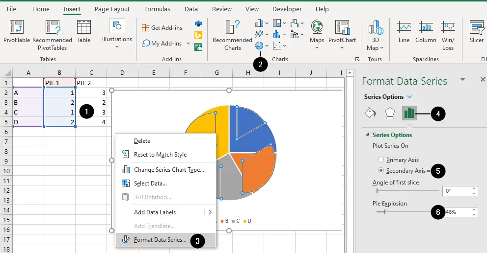
- Select that
A1:C5range, go to theInserttab, click on the Pie chart drop-down inChartsgroup, and choose the type of pie chart you want. - Right-click on the chart and choose
Format Data Series. - Make sure the
Series Optionsicon is selected. - Select the
Secondary Axisoption - Increase the
Pie Explosionvalue to move all the slices of the secondary axis away from the center of the chart.
You’ll get the chart shown in the figure:

By exploding the pie, you will not only separate the two axes, revealing the second pie chart but also compress the pie chart plotted on the secondary axis, allowing you to see both charts.
Now, select each slice of pie in turn and drag them back to the center of the pie, producing the chart shown in the figure below. Remember that two slow clicks will highlight an individual piece of the pie.

Join all the pieces of the pie again, and you will have a fully functional pie chart plotting two series of data on separate axes. Now you can color and format accordingly.