This tutorial explains, how to automate data copying across multiple workbooks in Excel using VBA. Imagine you have several workbooks, and each one contains specific data that you want to consolidate into a single sheet. Instead of manually opening each file and copying the data, we’ll use a simple VBA macro to do this in one go!
Author: BrainBell
Categories
Create a Speedometer Chart
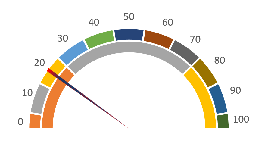
Excel offers many different types of charts except a speedometer chart. In this tutorial, we’ll create a really impressive, workable speedometer chart by using a combination of doughnuts and pie charts.
Categories
Create a Thermometer Chart
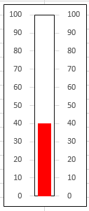
Make a simple clustered column chart to compare values across different categories. Then, by tweaking the chart elements, you can easily turn it into a thermometer chart for a clear visual representation of your data.
In Excel, you can create a chart without directly storing data in cells by using the SERIES function. Here’s a basic example of how you can achieve this:
Categories
Updating Charts Using The SERIES Function
Although creating new charts is wonderful, updating them to reflect new circumstances can take a lot of effort. You can reduce the amount of work needed to change the data used by a chart in a number of ways.
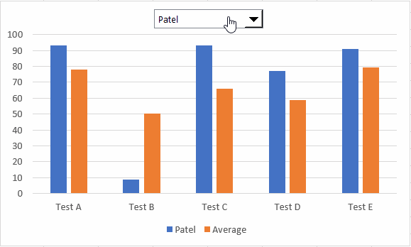
To make your chart truly interactive, you can use one or more dynamic ranges in your chart and then use a drop-down list from the Forms Controls to reveal the figures your readers want to peruse.
In this tutorial, we will cover the following steps:
1. Creating a chart.
2. Setting up three dynamic named ranges.
3. Editing the chart to utilize the named ranges.
4. Developing macros to update chart data at specified time intervals.
5. Executing the macros to animate the graph or chart.
Categories
Create Scrollable Charts
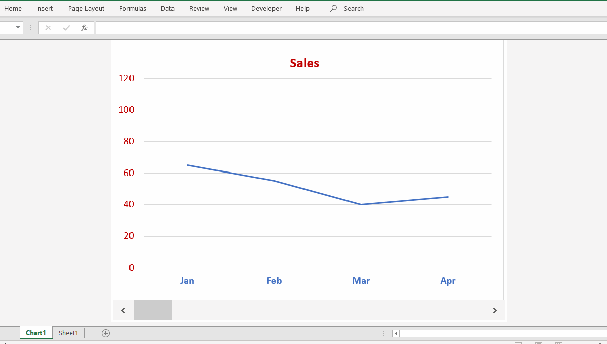
To make your chart truly interactive, you can use one or more dynamic ranges in your chart and then use a scrollbar from the Forms toolbar to reveal the figures your readers want to peruse.
Categories
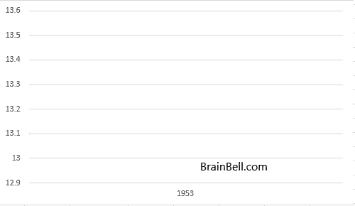
Date or Time Scaling in a Chart
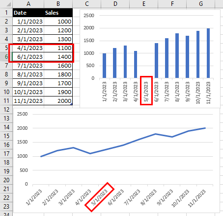
Excel handles dates and times by treating them as numbers, allowing it to adjust the chart scale accordingly. When you input actual dates, Excel automatically recognizes them and adjusts the chart. But what should you do if Excel doesn’t represent the text as dates on the chart?
Categories
How to Change the Scale on a Graph (Chart)
The chart scale is like the ruler for a chart or graph. It tells us the smallest and biggest numbers we see on the chart. It also shows how the numbers are spread out. By following these steps, you can change the scale on a graph (chart) in Excel to better visualize your data.