The Format Axis pane allows you to adjust various scale-related settings. These settings may include Bounds (Minimum, Maximum), Major Unit, Minor Unit, and other scale-related options. Modify these settings to change the scale.
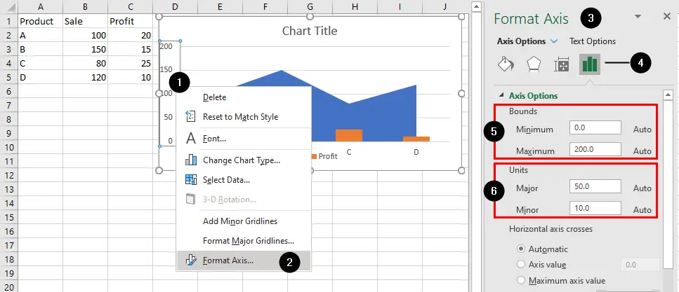
- To adjust the X-axis or Y-axis scale right-click on it.
- Choose
Format Axisfrom the context menu. - The Format Axis pane will be displayed on the right of the Excel window.
- Click
Axis Optionsicon. - The Bounds section allows you to specify the minimum and maximum values for the axis. This is particularly useful when you want to control the range of values displayed on the axis, customize the scale, or zoom in on specific data points within a chart.
- Minimum: This option allows you to set the minimum value of the axis scale.
- Maximum: This option allows you to set the maximum value of the axis scale.
For example, if your data ranges from 0 to 200, but you want the Y-axis to start at 10 instead of 0 and end at 160 instead of 100, you can enter 10 in the Minimum box and 160 in the Maximum box. This will change the axis scale to start at 10 and end at 160.
- The Units section allows you to specify the
MajorandMinoroptions to allow you to control the intervals or steps between major and minor tick marks on an axis. These options are particularly useful for customizing the scale and appearance of the axis in your chart:- Major refers to the major tick mark intervals on the axis. Major tick marks are the larger, more prominent tick marks that typically appear at regular intervals along the axis.
- Minor refers to the minor tick mark intervals on the axis. Minor tick marks are smaller, less prominent tick marks that can appear between the major tick marks, providing additional reference points.
For instance, if you set Units Major to 20 and also specify Units Minor as 5, you will have minor tick marks at intervals of 5 between each major tick mark. This results in major tick marks at 0, 20, 40, 60, 80, and 100 on the axis and minor tick marks at 5, 10, 15, 25, 30, 35, 45, 50, 55, 65, 70, 75, 85, and 90 on the axis.
Tick Marks
To adjust tick marks on an axis scroll down the Tick Marks section in the Format Axis pane (under the Axis Options). Excel allows you to choose one of the following options for the Major and Mintor tick mark types:
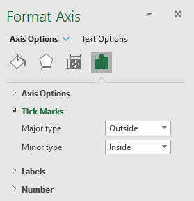
- Outside: positioned outside of the chart plot area.
- Inside: positioned inside the chart plot area.
- Cross: positioned to both sides of the axis line, effectively crossing it.