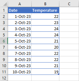
If you use dynamic named ranges instead of range references, your chart will automatically include any new data you add to your worksheet. To see how this works, start with a blank worksheet and enter some data similar to what you see in the example in Figure.
To create the chart and make it dynamic, you need to add two named ranges. One of the named ranges is for the category labels (Dates) and the other is for the actual data points (Temperature).
If you are unsure as to how to insert a dynamic named range, check out Create Dynamic Named Ranges, which discusses this in full.
Create a dynamic named range called TEMP_DATES for the dates in column A by selecting Formulas » Define Names, and type this formula:
=OFFSET($A$1,1,0,COUNTA($A:$A)-1,1)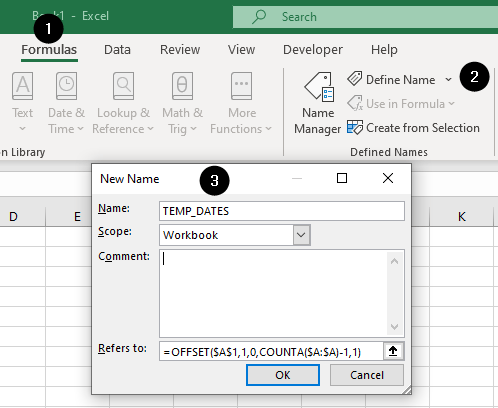
Notice that you included a -1 immediately after the COUNTA argument. This ensures that the heading is not included in the named range for that particular series.
Next, for the Temperature readings in column B, set up another dynamic range called TEMP_READING, using this formula:
=OFFSET($B$2,0,0,COUNTA($B:$B)-1,1)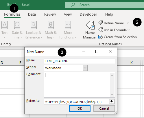
Now you can create the chart using the dynamic named ranges you created in lieu of cell references. Select the data range A1:B11, go to the Insert tab and select the chart type you want to use from the Charts group (we will use the Column type).
Excel will place the chart on the sheet. Now, proceed with these steps to configure the chart to utilize the dynamic ranges we created in the previous instructions:
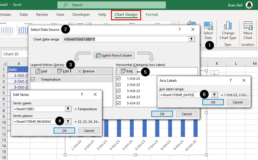
- Select the chart, go to the
Chart Designtab of the ribbon, and clickSelect Data. - The Select Data Source dialog box will be displayed.
- Click the
Editbutton in the Legend Entries (Series) section. - Delete the formula that presently sits in the
Series Valuesbox, and enter the following:=Sheet1!TEMP_READINGand click OK. - Click the
Editbutton in the Horizontal (Category) Axis Label section. - Delete the formula that presently sits in the Axis label range box and enter the following:
=Sheet1!TEMP_DATESand click OK. - Click OK.
Once this chart is set up, every time you include another entry in either column A (Dates) or column B (Temperature), it will be added to your chart automatically.
Plotting the Last x Number of Readings
Another type of named range that you can use with charts is one that picks up only the last 10 readings (or whatever number you nominate) in a series of data. Try this using the same data you used in the first part of this tutorial.
For the dates in column A, set up a dynamic named range called TEMP_DATES_10DAYS that references the following:
=OFFSET($A$1,COUNTA($A:$A)-10,0,10,1)For readings in column B, set up another dynamic named range called TEMP_READINGS_10DAYS and enter the following:
=OFFSET(Sheet1!$A$1,COUNTA(Sheet15!$A:$A)-10,1,10,1)If you want to vary the number of readings to 20, change the last part of the formula so that it reads as follows:
=OFFSET(Sheet1!$A$1,COUNTA(Sheet15!$A:$A)-20,1,20,1)Using dynamic named ranges with your charts gives you enormous flexibility and will save you loads of time tweaking your charts whenever you make an additional entry to your source data.